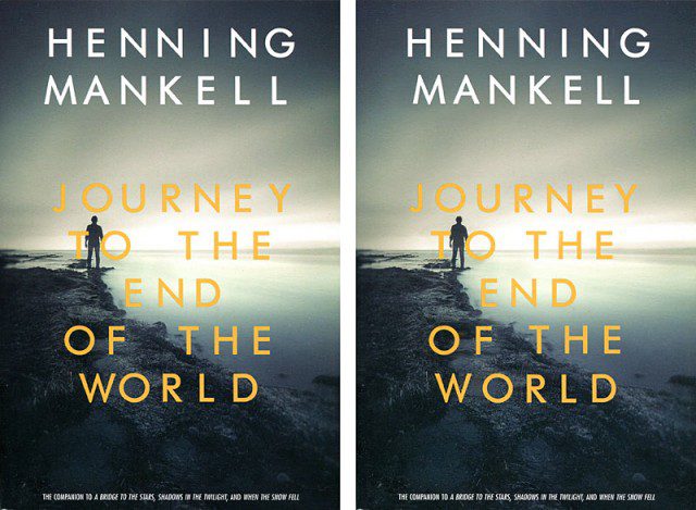
It is difficult to imagine a publisher tolerating bad grammar or the mis-use of vocabulary in the content of a book, so why would they accept the equivalent thing graphically on the jacket? The concept here is fine. The use of Gill Sans as a typeface and the selection of the photo and color palette work very well, but the type appears to have been spewed out of a computer onto the page with no further consideration. In the left illustration, as published, why is the W of WORLD creeping lasciviously toward the O? Why isn’t the book title centered under the Author’s name, and why aren’t the authors first and second names optically centered with each other? Why are the N’s of HENNING rubbing shoulders while the poor little I is left all alone and unloved. And who is MA NKELL, the author’s mother perhaps? And the spaces between the words are big enough to drive a truck through. With a design composed of just 39 upper-case letters, the whole point is to put them down caringly on the paper in the right place. Anyway, on the left is how it is, and on the right a suggestion of how it could have perhaps been improved, in this case courtesy of half an hour’s work in Phototshop. With an hour’s work in the original layout program it could look even better. Aaargh! (I hope that was spelled correctly).

